Friday, January 29, 2010


I did a logo for a cafe that serves coffee and tea. I was aiming for something like a neighboorhood cafe were you can come with a friend and spend your time chating with a great cup of tea or coffee. Based on this i was trying to make a funky and pleasent logo that will be attractive but at the same time pleasent for an eye. I did not use any photos, just a trace of coffee bean and tea plant to make them look like letters. And made that to make logo look creative. This logo works perfect on a paper cup. Three words about my company: friendly, welcoming, relaxing.

Thursday, January 28, 2010


I find it a beatifull and emotional picture that is perfectly dedicated to the tragedy of December,6. I made it in black and white so it can reflect more sorrow and pain that came with the tragedy. But at the same time I made the red message as the focus of the picture. At the same what i was trying to show through the message is that we will never forget what happened and will never let anything like this happen again.

Monday, January 25, 2010


For the Student Nutrition Program our main goal was to inform and to encourage students to take part in this program. For this we made a poster. We did this through a catchy colourfull puzlle. We trying to explain people that breakfast is the main key/puzzle piece for your whole day. It helps you to focus, to be energetic and always to be in a good mood. And I realy think that we succseeded in our plans. Poster turned out to be realy catchy and made people pay attention to it.

Friday, October 23, 2009

Self-portrait


Basicly, my self portrait is made of simple letters and elements. By this I was trying to show my personality, that is simple and easy to understand. While doing it, I also tried to make it close to my actual look.

Thursday, October 15, 2009

Thursday, September 24, 2009

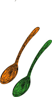
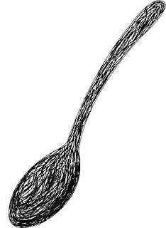
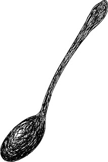
Spoon Trace


Because my first final trace of picture was lost (dont know how it happened), I had to re-trace my picture. Even though my first work was better than the new one, it gave me a lot of experience in working with Illustrator.
During the work from the tools I mostly used Pencil tool and Brush. However, to make the rounds of my picture smoother, I used the Anchor tool. All this worl gave me an experience how to make your picture look more perfect and more realistic.
After finishing all of my work, I found out that the very first trace of my pixture turned out to be the best of aal my works. Probably because I had an actual picture in front of me, I did it better without missing all this little details.